Hotel Booking App Case Study
This project was completed to obtain a diploma in UX design from the UX Design Institute, accredited by Glasgow Caledonian University.
Overview
The task was to design a fictitious start-up hotel booking app, focusing specifically on the booking process: how users search for hotel destinations, find, and select hotels online.
The intention was to create an app that was fast, easy, and intuitive; one that’s based on a deep understanding of target users.
The end goal was to design and build a medium fidelity clickable prototype that could be tested with users.
Roles
UX Researcher and UX Designer
Tools
Figma, Miro, Camtasia, Adobe Illustrator, Adobe Photoshop
DURATION
The project was completed in 6 months (part time) along with the coursework
Process

Research
Competitive Benchmarking
At the discovery phase of my project, I reviewed four mobile hotel booking apps to gain insights on how to best design my own app. My objectives were to learn how best-in-class apps solve problems that I was trying to solve. I wanted to understand the conventions I should follow, and learn best practices to emulate in my own app.
Mobile Apps Researched: Barcelona Hotel Group, The Doyle Collection, Kayak, Priceline
Usability Testing
Before starting the design phase, I took detailed notes from four pre-recorded usability tests conducted by the UX Design Institute in order to get a better understanding of users goals, behaviors, positive interactions, and pain points, with popular mobile hotel booking apps.
I then conducted two usability tests of my own, to get a more in depth understanding of the problem and how I could solve it. These tests were conducted remotely, and I prepared an interview script with questions beforehand.
Interview/Usability test script overview:
Welcoming the user
Explaining the goal of the usability test: to identify issues that could be fixed, and pinpoint areas for improvement
Explaining the room/remote setup
Reminding the user that we’re testing the product and not them. Instructing them to verbalize their thoughts and actions throughout the test. Telling them we were not involved in the design process, so it didn’t hinder their feedback.
Basic introductory interview questions: personal background, which hotel booking apps the user usually used, and their hotel booking history
Usability Test Tasks: user was to book a hotel room in Barcelona, with breakfast included
App Homepage: what do they see, what are they looking for, what will they do next?
App Results page: what do they see, how they find a hotel in their desired location, how they find a suitable room, how they search amenities and add extras, what will they do next?
App Conclusion: what they liked /disliked, was there anything they expected to see but didn’t, was there anything they were surprised to see, and their overall experience with the app
Insights:
The most common pain points from the apps came from lack of clarity.
Pain Points:
Unclear hotel locations, no destination descriptions, no map options, no reviews/ratings, included pushy add-ons, hard to navigate calendars
Positive Interactions:
Easy navigation, pictures of hotels/locations, included map options, clear reviews/ratings, descriptions of destinations, clear price points
“The hotel sells itself with the pictures.”
— Usability Test User
Analysis
Affinity Diagram
I created an affinity diagram using an online card sorting method, that helped me sort through the large volumes of data, and get to the root of my findings.
I grouped my competitive benchmark and usability test findings into categories.
I focused on the users behaviors, positive interactions, negative interactions, and their expectations.
These categories helped me further analyze design decisions.
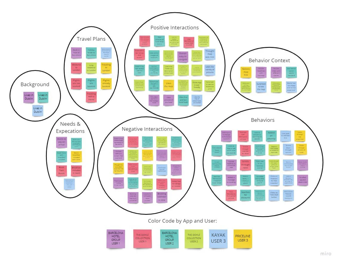
Made with Miro
User Journey
To define high-level steps in the user’s journey towards booking a hotel on a mobile app, I created a user journey map.
Insights:
Showing pictures of the hotels and destinations helped humanize the experience and make it more enjoyable
Users wanted specific locations of hotels and information on those locations, because if they were travelling to a new place they likely don’t know the area
Users searched for hotel locations, not hotel names
Simple search options created positive experiences
Highlighting key points such as price points and reviews created ease of use
Upselling jargon negatively impacted the value and clarity of offerings
Users didn’t want the cheapest hotel, but wanted the best deal
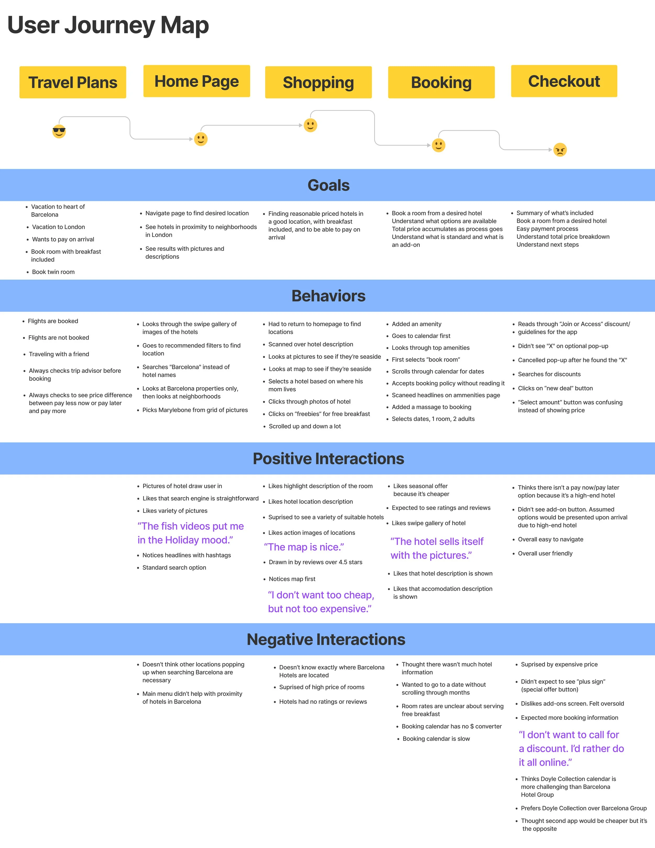
Made with Figma
Design
User Flow Diagram
At the beginning phase of the design stage, I created a User Flow Diagram. The overall objective was to fix the issues that I uncovered during my research.
I defined a high-level flow for the mobile hotel booking app, and focused on one flow for the case study.
The flow shows the path a user will take to complete a task. This task is to book a hotel room. The flow shows this task from the home screen all the way to the payment confirmation screen.
The flow underwent several changes after I began sketching the screen.
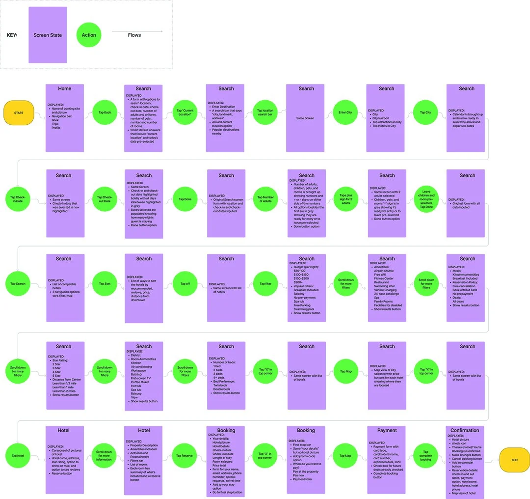
Made with Figma
Interaction Design Sketches
I started the design process with low fidelity wireframes to iterate through many design options quickly.
I focused on making the app simple to use and visually appealing. I made completing fields trigger points to move forward to the next screens, instead of using “next” buttons on every screen. I wanted to make the process easy and trim down any unnecessary steps. I also added positive interactions from my usability tests such as including a variety of pictures, map options, clear price points, reviews/ratings, and descriptions of each hotel and room.
My sketches helped me move forward from pen and paper, to a digital wireframe.


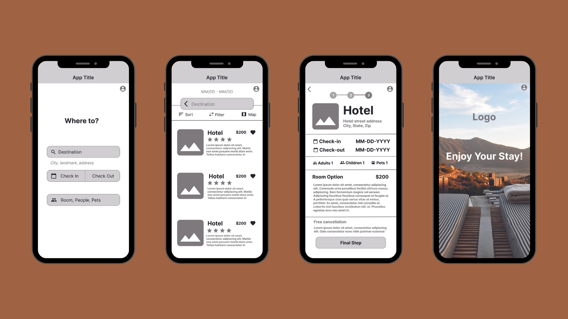
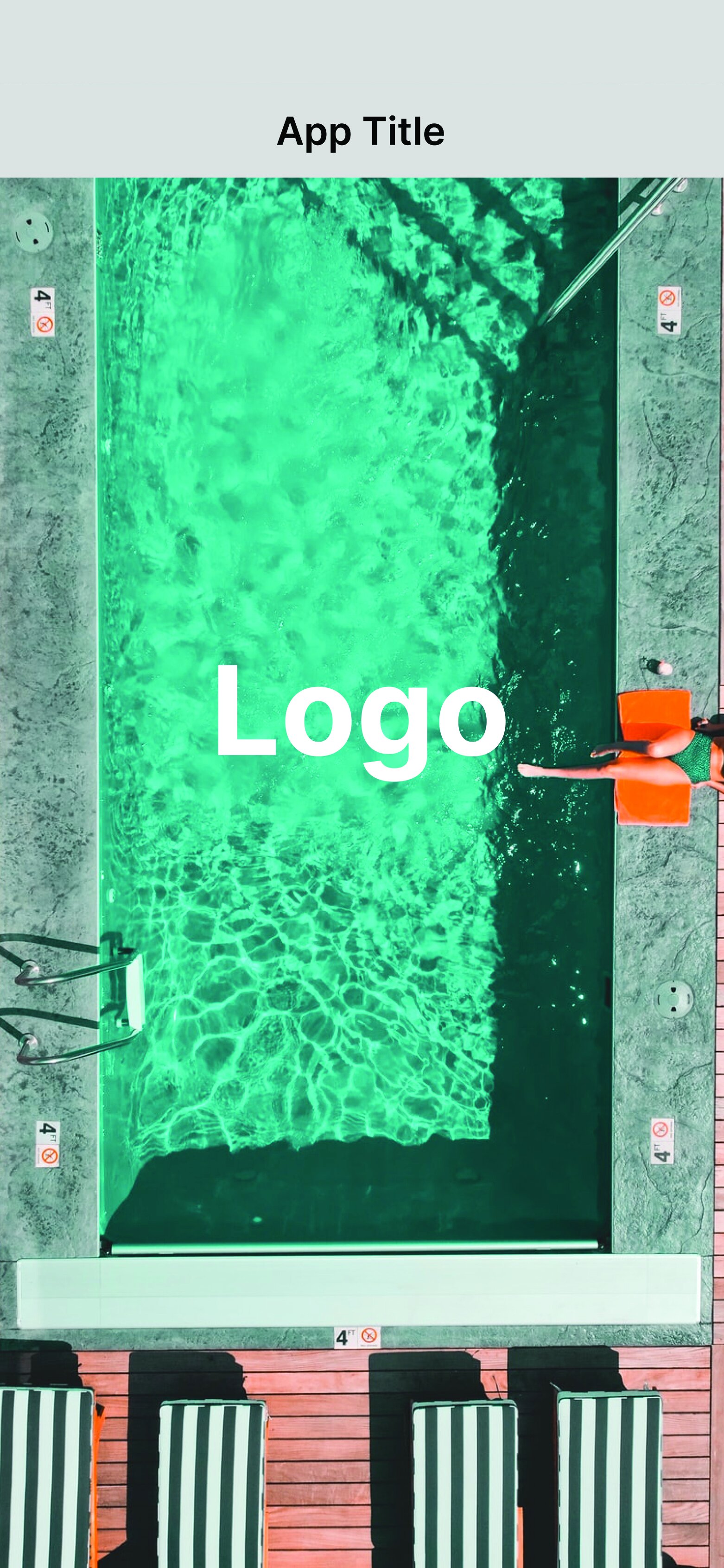
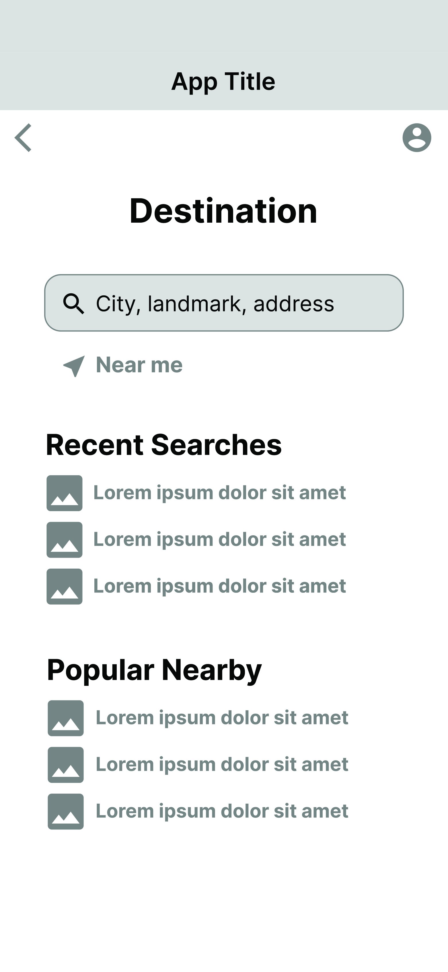
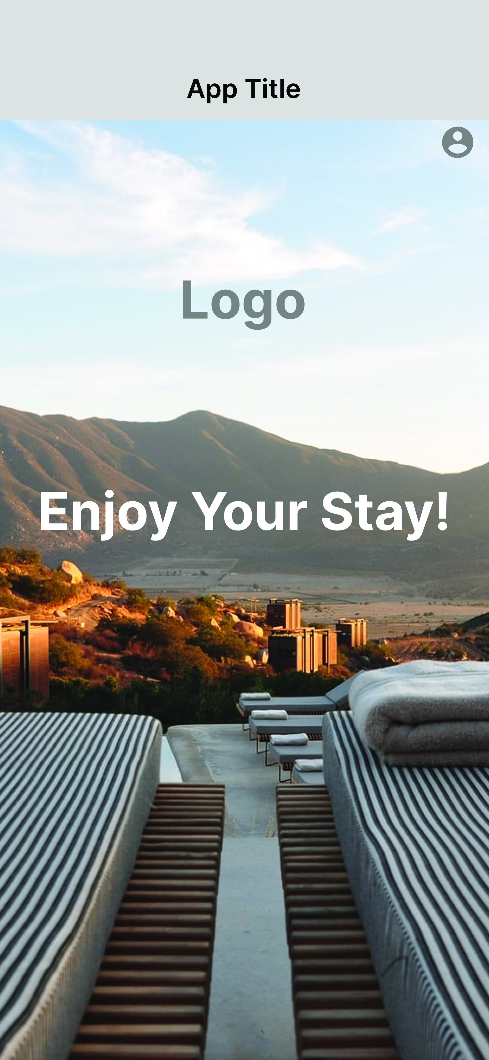
Medium-Fidelity Prototype
I focused on a single flow of finding and booking a hotel room for this medium-fidelity prototype. The clickable prototype is setup only for this flow, and has limited functionality. The clickable parts represent the interaction and navigation possibilities of this hotel booking app. This is a basic visual design that is meant to demonstrate an interactive behavior, and let the potential product speak for itself. I created the screens for this medium fidelity prototype in Figma.


Delivery
Annotated Wireframes
The annotated wireframes describe the functional purpose of individual elements on the screens, or of the screens themselves. I tried to include as much information and detail as possible. I wanted the design choices on each screen to be clear for the developers that would be taking over the project.
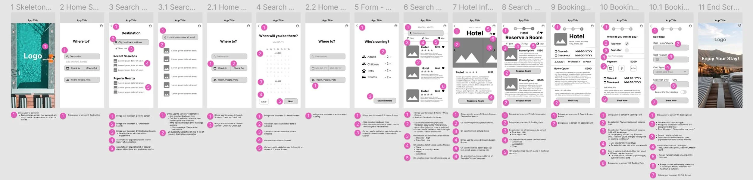
Made with Figma
Reflection & Next Steps
My key takeaways were that users want a simple and upfront hotel booking experience. Time is precious and users didn’t want to scroll for important information, or be bombarded with upselling. Using aesthetically pleasing UI elements, pictures, and basic design principles appeal to the user. Creating an enjoyable experience means empathizing with the user’s needs, and providing value. That value for users means improved customer satisfaction and loyalty for business.
My next steps in this project are to perform usability tests on the medium-fidelity prototype to further optimize the design. Then I plan to create a more advanced high-fidelity prototype, with a more complete representation of the aesthetics and functions of the final product.